Tag Archive for: landscape design

Coordinating Color for a Fantastic Fall Garden

One of the most difficult things to do when designing a garden bed or container is figuring out which plant combinations to use. With so many beautiful plant types and varieties to choose from, how do we narrow it down to a few that will really look great together? Quite often, we end up gravitating towards plants that catch our eye, but end up clashing in the garden. The fall can be especially overwhelming, with the bold reds, crisp yellows, and bright oranges of the season. It is easy to get carried away with all the new colors that the season offers. By no means does this mean you need to shy away from them. As a landscape designer, I often refer back to the basics of color theory to inspire and direct beautiful color combinations in the garden. You too can use these guidelines to create a stunning display of fall color!

The Basics of Color

Just like selecting a wall paint or window dressing for your living room, carefully combining colors in an outdoor space can help you create a cohesive design composition. Here are the three basic color combinations that I often refer to during the design process (discussed in more detail below):

  • Monochromatic
  • Analogous
  • Complementary

These color schemes are formed based on the color wheel, which many of you are probably familiar with:

The color wheel depicts primary (yellow, blue, red), secondary (orange, green, purple), warm (yellow, red, orange) and cool (blue, green, purple) colors.  Complimentary colors are those that opposite each other on the wheel.

Combining Colors for Fall Beauty

You can use color theory to combine plants in any way you want at any time of year. Since it’s fall, I’ve selected a few of my favorite seasonal plants to illustrate monochromatic, analogous, and complimentary schemes. These plants look beautiful together, but by separating out the plants we can create a variety of distinct styles in our gardens.

Boxwood, heuchera, japanese stiltgrass

Monochromatic with Green Foliage

A monochromatic scheme incorporates only one color and its values. By selecting various shades, we can create a strong, cohesive visual effect. One of the most commonly used monochromatic designs in landscaping is variations of green in a shady part of a garden. Using green in these spaces enables us to use a wide variety of shade-friendly foliage plants. The combination pictured above includes boxwood, liriope, a green foliage heuchera, and a fern.

Burning Bush, Mums, Pumpkins

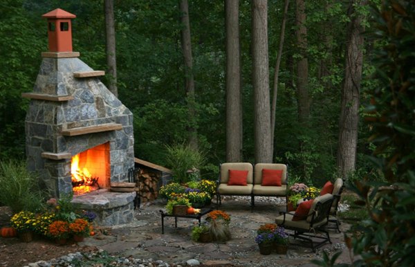
Analogous with Red and Orange Foliage, Blooms and Pumpkins

Analogous colors can be found next to each other on the color wheel. Using this combination creates a pleasingly harmonious variation. Color combinations of this type generate a pleasing energy in the garden without using too many colors. Here, I’ve combined orange and red for a display of fall color using pumpkins, mums and a burning bush.

Boxwood, Mum, Heuchera, Liriope, Fern

Complementary Colors

Pair the opposing colors on the color wheel for an undeniably bold approach to gardening. Complementary colors “complement” each other by making the other color appear more intense. If you are looking for a high energy space, pairing complementary colors in your garden is a great start. In a fall garden, combining red and green is a great choice. In the photo above, I’ve paired the green foliage of liriope and boxwood with the red foliage of heuchera and the red blooms of fall blooming mums.

Have Fun and Try a Variety of Combinations

While the color schemes used in this post are a great starting point, I always encourage gardeners to try out whatever color scheme makes them happy. The point is to have fun with color and make a beautiful garden you love!

Fire Up Your Outdoor Lifestyle

Mary Kirk Menefee, Merrifield Landscape Designer

Are cooling temperatures and shorter days making you think of a cozy gathering around a fire? It’s no wonder. Fires have a primal draw. They are a source of warmth, comfort and hospitality. They engage all of our senses, and as a result, seep into our memories.

For me, a crackling fire harkens back to so many wonderful times and places. When I was very young, my grandmother would take my sister and me to a spot of open land near a creek and teach us how to build a little campfire and roast hotdogs and marshmallows on sticks. She kindled not just fire but a love of the outdoors. Later there were campfire sing-a-longs at summer camp, bonfire pep rallies and gatherings with friends around all manner of campfires and fire pits.

As a designer, I love to have to the opportunity to bring this kind of experience home to my clients. This is good thing, because fire features have become very popular. Every year, I seem to get more requests to create space for a fireplace, fire pit or chiminea in a landscape. Everyone seems to be craving that warm, hospitable place within the garden. What’s more, the warmth of a fire extends outdoor fun well into the late fall and even winter months. You don’t have to move to California to enjoy year-round outdoor living!

What you do need to do is apply a little thinking, planning and creativity. Options for fire features are nearly limitless, so if you think only of a raised stone circle, think again. As you can see from the photos below, the fire features Merrifield has built in the past few years range from elaborate outdoor living rooms, complete with fireplaces, to rustic camp-style pits to movable fire bowls. Clients who have completed such installations tell me their fire features tend to be some of the best-loved and most-used of their landscape additions.

Looking beyond the DC area, there are even more creative options to discover. In the western US and Australia, where wood-burning fires are largely prohibited, many people opt for gas fire features with sleek, modern designs. With the ability to simply turn them on and off, they fit into all kinds of unexpected places. Check out Pinterest and Houzz for some stunning examples.  Maybe you’ll end up in the vanguard of homeowners bringing this trend to the East Coast. Whatever you do, don’t limit your imagination. A Merrifield Garden Center designer can help make your dream a reality.

When working with a designer on your fire feature, the first two things he or she will consider are the available space and how you intend to use it. While built-in fire pits and fireplaces generally need generous surrounding hardscapes and to be positioned 20-25’ from structures, such as your house, portable fire bowls and chimineas can be used in smaller, closer spaces. In general, it is not recommended to put fire features under roofs or pergolas or on top of wood decks (and yes, believe it or not, that is a common question). Wood burning fire features are ideal for people who want a campfire experience, gas features are better for those who crave the ambiance with a bit more simplicity.

A few questions a designer might ask when planning your fire feature are:

  • How much space do you have/want to dedicate to this particular feature?
  • Do you need this space to be convertible (dedicated to fire for small gatherings, open space for large-scale entertaining)?
  • Is there any space 20-25’ from a structure?
  • Should the space be an extension of your home or a destination out in the garden?
  • How many people would you like to have gathered around the fire?
  • Will you be using the fire for cooking?
  • What factors (e.g., hassle of getting it started, safety concerns, no dry place to store firewood) would prevent you from using the fire feature often?

Once you’ve honed in on the location and the type of fire feature you want, it’s time to think about feeling, style and materials. What feeling do you want to create? The memory of a cozy campfire? A luxurious resort? A romantic retreat? Think about whether the space should feel enclosed and intimate or open and exciting. What aesthetic choices will contribute to that feeling?

As you’ve seen, aesthetics for fire features are as varied as any home or garden. Ideally, the style and scale of your fire feature, home and garden would all be the same—yours!  If your home tends toward cozy and rustic, with exposed beams, lots of natural materials, and a loose woodsy garden, a grand brick chimney might seem out of place. However, it might be the perfect thing for a more formal home with a white-columned pergola and parterred herb garden.

To point to a more concrete example, recently, I designed an outdoor living area with a fireplace to be a true extension of a home. Because the home sits on a steep hill within a woodland of tall trees, the living area and the fireplace needed to be bold, with large proportions, to be in scale with their surroundings. They also needed to be one with the house to avoid looking tacked-on. To get this seamless look, we used a stone veneer that was already on the house to cover the fireplace and adjacent retaining walls. The bold proportions come from chunky, rough-hewn stone for benches and wall caps and large-scale pavers for the patio that echo the colors in the veneer. The result is very cohesive, as though the outdoor area was built right along with the house.

What are the stylist hallmarks of your home’s character that you can transport into the landscape with a fire feature and surrounding patio or garden?

Here are a few aesthetic notes to look for:

Materials

  • Stone – notice color, texture and visual weight
  • Brick – notice color, finish and age
  • Stucco/Dryvit – notice color and relationship to other materials
  • Copper – notice patina and degree to which it gives the house character
  • Wrought Iron – notice it’s shape and stylistic details

Style

  • Formal – look for symmetry, heavier, traditional materials, classical details
  • Rustic – look for natural materials and details, situation within the landscape, feelings of “woodsiness” or “beachiness”
  • Modern – look for clean lines, spare or quirky details, asymmetrical and nontraditional spatial relationships.

Having a location, type, scale and feeling in mind and a few stylistic details for inspiration, you are ready to create the perfect place to warm those chilly evenings in the coming months. Invite some friends … open a bottle of wine. What could be better?

Designing Gardens Using Color Theory

Mary Kirk Menefee, Merrifield Landscape Designer

As a designer, one of the most common phrases I hear is “I want color!” It would seem to be a simple request, but stop and think about what it means, and there are suddenly too many directions in which to turn. What good is a handsome house with elegant hardscapes and a solid structure of trees, shrubs and generous planting beds if those beds look like every orphan plant in the annuals section came to take root in them?

Basics of Color Theory

Using color in an elegant and sophisticated way requires us to take a trip back to high school art class. Do you remember that project where you had to paint an elaborate color chart, noting each hue, tone, tint and complement? It’s time for a refresher!

The chart above summarizes the basics of color theory and introduces some important vocabulary:

  • Hue: A hue is the color itself. Red, yellow and blue are primary. Orange, green and purple are secondary. All of the hues directly between a primary and a secondary color are tertiary. Hues directly across from one another on the wheel are complementary.
  • Value: Value refers to lightness versus darkness or the addition of white and black. A hue with white is called a tint. A hue with black is called a shade.
  • Purity vs. Muting: Whereas tints and shades are pure hues, muted colors can be made by combining hues. Hues mixed with their complements are called tones. If combined in equal proportions, two complements will make a neutral, like grey or tan. Since tones can also be tinted or shaded, we now have a full range of colors.

Color Schemes

With the basics in mind, we can begin to think about crafting color schemes that will give the garden strength and meaning. In general, it’s best not to try to use every hue. Limiting your pallet can be a challenge when there are so many beautiful plants to catch your eye, but your restraint will be rewarded with a pleasing unity and harmony. You also will need to decide if green will play a role in the scheme itself or if it will serve as an honorary garden neutral. If you are unsure where to start, there are a number of color scheme “formulas” to try.

  • Monochromatic: This color scheme focuses on just one hue and explores all of its tints, shades and tones. Common examples are white gardens, where flowers and foliage range from grey to snow white to cream, as shown to the right. Another is a romantic pink garden, where flowers and foliage fall within the red-violet family, be it mauve, rose or maroon.
  • Analogous: This color scheme pairs two hues that are next to each other on the color wheel, such as blue and purple or orange and yellow.  Again, a range of tints, shades and tones can add depth and contrast.
  • Complementary: This color scheme pairs hues that are across from one another on the color wheel. One of my favorite pairings is yellow with purple. Each color is easy to come by in both flowers and foliage, so the combinations are endless and can produce strikingly different results as you can see in these two examples.

          
Color-blog-photo2

With any scheme, remember that the colors need not all be bright or loud. A successful variation of a double complementary scheme pairs a more pure hue with others pushed toward neutral, as in this green and grey garden. Can you spot all of the hues and how they relate to one another?

Plan Your Color Scheme

Now that you have a basic understanding of color theory, it’s time to get out the paints and put your scheme down on paper. If painting is not for you, visit your local hardware store and put together a collage of paint chips. Try to include no more than seven colors—remember this means a combination of tints, shades, tones and neutrals—not seven different hues. Make each one larger or smaller according to how much you intend to use it. Try a few variations. Your result might look something like this:

As you work through this exercise, here are some tips to help you build the perfect color scheme:

Start with hue

What color(s) do you want to use?
Tip: Limit color selection for more unity; pay attention to the underlying hues within neutrals to ensure harmony.

Consider contrast

How bold do you want to be?
Tip: Complements will be more— bold, changes in value and tone within the same hue can be more subtle.

Think about dominance

What leads? What accents?
Tip: Try a blend of neutrals and tones with one strong accent color.

Reflect on mood

What feeling do you want to bring?
Tip: Warmth and contrast tend to be energetic, while coolness and subtlety tend to be more calming. Blending these ideas can be edgy.

Don’t ignore your givens

What colors can you not avoid because they already exist as part of the space?
Tip: Diagnose the underlying hues in your house and hardscapes.

Plan for seasonality

How will the garden change throughout the year?
Tip: Group plants that shine at the same time.

When you’re happy with your color scheme, bring it to Merrifield Garden Center and look for stone, planters, garden art and plants with foliage or flowers that fall within it. Don’t forget that plants need to be able to thrive in your conditions or you might end up with some unintended brown.